One week into Android: Thoughts and Ruminations from an ex Fanboy.
With the iPhone, it feels like Apple took the existing concept of the mobile phone and evolved it to become the internet connected iPhone we know today. With Android, Google took the laptop computer, and shrunk it down to fit into the palm of my hand.
No you have not time travelled back to 2008, yes you are reading an iOS vs Android article in the year 2014. Those who know me well have always called me an Apple fanboy, and in fairness, not without reason. I have had an iPhone from within a week of its original US release (and while that seems pretty normal, I was living in Cairo at the time, a country that would not be officially supported by Apple for another three years, so procuring an iPhone without traveling abroad was "tricky" to say the least).
But last week, a week before the iPhone 6 announcement - my iPhone 5 was on its last legs (with a battery not lasting more then an hour or two), and when Apple sent me an email informing me that they had managed to run out of replacement batteries for my dying iPhone five, I decided I couldn't wait any longer - and it was time to see what the dark and mysterious world of Android was all about.
Now with the announcement of the iPhone 6 (bigger, faster) - I am sure a lot of you are wondering the same thing - and even though I know iOS vs Android posts are clichéd - I thought I would try to do my best to give an overview of my thoughts, one week into Android.
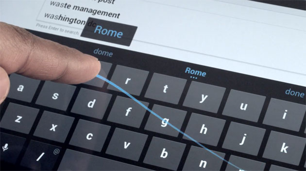
The swipe keyboard is the future
Really, it is. If you don't know what I am taking about, you should watch this video, but in reality you won't realize how awesome it is without trying it out yourself. I can actually write text on my phone without having to look down at my screen, and I am writing drafts of this post on my phone now. The speed and consistent accuracy of the keyboard is absolutely transformational.

Bigger screens really are better, but the way we think about interfaces needs to change
I used to think that all android phones were too large, but even after a week my old broken iPhone 5 feels like a toy in my hand, and with the iPhone 6 I guess the topic of screen size is moot as the industry standardizes around ~5 inch screens..
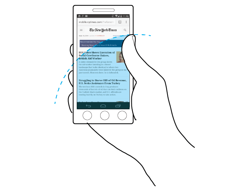
That being said, mobile interfaces have not evolved as quickly as mobile hardware has, and no one seems to be taking thumb reach into account when designing application UX - specifically - the majority interaction points in most applications are placed at the top of the screen, when in reality, the bottom 3rd of the screen makes the best location for anything the user needs to regularly interact with. I am genuinely surprised that no one has implemented newer UX models with larger phones.

OMG copy paste, get it right guys
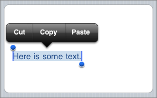
This is something that actually took me an embarrassingly long time to figure out. The copy icon for Android is in fact not placed on a contextual menu popup like the iPhone but instead is always at the top of the screen. Referring to my previous point again, unreachable by my thumb without quite the stretch.

Lack of Consistency
This point is best hammered home through the previous point. So Android places the copy icon at the top of the screen - I can get used to that. But what makes this user experience absolutely horrible is that this control can be positioned anywhere by app developers - and as displayed below - sometimes it the first icon slot, sometimes the second, sometimes the fourth?
![]()
I know the Android ecosystem is represented by its open philosophy - but design standards like these are important in creating a seamless experience for the user, and not one where they are constantly forced to hunt and peck throughout their phone.
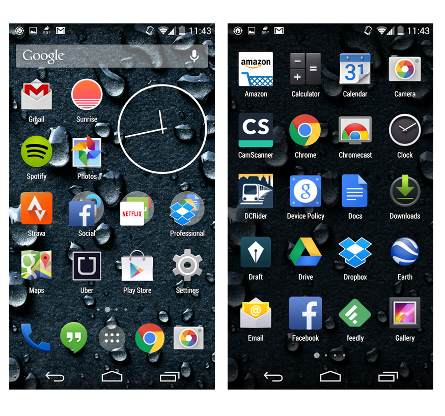
Wow I have a desktop for my apps.
I knew that Android organized its apps this way from playing with my friends phones, but I didn't realize how big of a deal this was until I had an Android phone myself. In a way this is great because it allows me to organize my desktop any way liked - but on the other hand, my apps now appear in multiple places in my phone, and it seems like just another thing for me to manage. I didn't like this setup in the beginning, but my next point will explain why I am warming up to it and I understand its purpose.

Less out of the box, more options for customization.
While this is pretty obvious multiple years into these phones existence - the fact that I can customize anything on my Android phone, also means I have a lot of additional apps to manage those customizations. Given that this is the case - having a desktop for the apps I really need (Gmail, Sunrise, and Imgur) vs the apps I use occasionally (Notification Manager) begins to make more and more sense.
Ugh fonts
Theres not much more to say here except that I absolutely detest the default system fonts.
Google Now is scary amazing and I absolutely love it.
I had heard a lot of amazing things about Google Now, and with the awesome Google Wear devices being released - I was really excited to give it a spin. For the first four or five days, I was completely nonplussed with what it had to offer. Until yesterday.
Yesterday my phone beeped to let me know that I should leave right away if I wanted to make my dinner date with my wife at 6:30pm.
I hadn't set it up, in fact I hadn't done anything directly - but through Gmail and Google Calendar - it knew where I needed to be, when I needed to be there, and the fact that this dinner was with my wife so I shouldn't be late and leave now.
And then again, today in the morning as I was leaving the house it beeped at me again, letting me know it would take me 19 minutes to get to work if I was leaving now. It knew I would be taking the subway (not driving), and informed me of the departure time of the train from my regular station (note that I don't take the station closest to where I live, and it knew that too). My trip ended up taking me 18 minutes door to door.
Amazing.
My wife couldn't text me for an entire week - but this was Apples fault.
My wife still has her iPhone 5c. Up until today, I couldn't figure out why any of the texts she was sending me simply weren't getting through - and then it clicked - her phone was still trying to send me iMessages.
Apple in its infinite wisdom, never checks to see that you are no longer receiving iMessages from your mobile device, and I had bought my phone unlocked so was never told by the carrier either.
According to this link, you first have to disable iMessages on your phone - a phone which I no longer had a functioning version of. A factory reset would work as well, but again - a functioning phone was required. I was able to disassociate my number with my account (which involved me going to an Apple support page I had never seen before), but the final suggestion really amazed me - if all else fails - you are advised to actually phone the Apple Support number (a number most people know never gets picked up).
As a tech savvy person, it took me a week to figure out that this was a problem in the first place - people just assumed I had been ignoring them! That accounts for some pretty evil Dark Patterns on the part of the Apple team to give you an immediately sub optimal experience if you are switching to an Android device.
Minus one for Apple, as underhanded tactics like this are definitely not appreciated.
Parting Thoughts
After a few days - the most succinct way I can put it is this: with the iPhone, it feels like Apple took the existing concept of the mobile phone and evolved it to become the internet connected iPhone we know today. With Android, Google took the laptop computer, and shrunk it down to fit into the palm of my hand.
Android feels more powerful, like I could do anything at all with it if I wanted to - but there are clearly some usability improvements that can still be made. If you are moving over from an iDevice - make sure to disable your iMessages, and be mentally prepared for your fair share of fiddling before you get everything just the way you like it.
Conclusions:
I plan on staying on this Android adventure for at least a year, and really giving it a go before I make a final call. For now I am appreciating the novel factor of it all, and I am looking forward to Android's new UI enhancements coming soon.